My team mates were Nathan Thomas, Skye Steen, Tasheera Jai Jai, Belinda Keppler and Lara Upton.
Friday, 22 March 2013
Words Have Consequences
One of our first projects for third year was to film a one minute movie (in groups) under the theme 'Be Part of the Solution'. We got the highest mark - 95%! It is stop-frame photography, we all had a part in shooting and editing it. We've have quite a few views on Youtube, and been featured on a blog and are going to be at the KZN Gay and Lesbian film festival, which is quite cool.
My team mates were Nathan Thomas, Skye Steen, Tasheera Jai Jai, Belinda Keppler and Lara Upton.
My team mates were Nathan Thomas, Skye Steen, Tasheera Jai Jai, Belinda Keppler and Lara Upton.
Wednesday, 20 March 2013
Lady Green Branding
For our end-of-year control project we were paired with a jewellery design student from our campus, and we had to design them a logo, postcard, business card, letterhead and blog. I was paired with Deidre Green, a 4th year student.
Flirt! Magazine
Another one of my favourite projects: design a magazine cover with a 3 page article, and 2 x 1 page artcicles ( I did 3 x 1 page articles). We had a day of shooting for the cover, and inside all the photos are mine except for the Dying to be thin? photo.
5fm Takeover Weekend
We designed A5 flyers to advertise the 5fm Takeover Weekend in Durban. My lecturer loved the first one, but I enjoyed making the second one so much too. We had to use only type again, although by then we were pushing the boundaries of "type only".
Pattern
One of my favourite projects from second year: design patterns. We started off making simple shapes (circle, star, diamonds etc.) and inserting them into the swatches panel. Then we were instructed to make shapes using a typeface. All of my shapes in the patterns (excluding the people figures and the circus pattern) were made from the font Monotype Corvisa. We had to have more than 1 colour option. I even ended up printing the first pattern (and it's complementary pattern - which is below the main picture) in black and white on fabric, and made cushions out of it - they look really cool!
Copy Cat
Using the self portrait, which we'd done at the beginning of the year, at the end of second year we did a project called Copy Cat. We had to choose 3 artists, then choose an illustration from each, and complete our self portraits in the same style. (and say how we achieved it). I chose Devon Smith, Jason Levesque and Am I Collective.
Self Portrait
In Adobe Illustrator we had to use the pen tool to draw lines (only lines) over a photo the lecture took of us, to create a self portrait
Monday, 18 March 2013
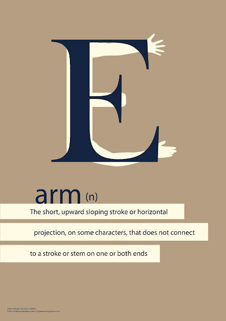
Typography Term: Arm
Brief: Use only type to visualise the meaning of a typographic term (arm)
I had fun with a few options, the top was my final submission
I had fun with a few options, the top was my final submission
Angels Biscuit Packaging
Brief: redesign Wedgewood's Angels Nougat Biscuits.
The biscuits are absolutely delicious, but their original packaging is not so great.
The biscuits are absolutely delicious, but their original packaging is not so great.
Portrait of a famous person: Rudolf Nureyev
Brief: choose a famous person. Illustrate them using visual metaphors.
Mine: . Rudolf Nureyev - a famous ballet dancer.
Symbols:
Soviet Russian Flag - he was from the USSR, a communist country, which he defected from
Male/female signs - he had many sexual partners, male and female
Teapot - he discovered the beauty of tea whilst in London. Also he was a HUGE fusspot
Piggy Bank - he came from a very poor family, and died a wealthy man
Cock/chicken - He was a big cock. Also: he would only eat steak for dinner. Whilst staying with Margot Fonteyn (a prima ballerina) he was served chicken for dinner. He said the a chicken dinner equalled a chicken performance.
Music notes - he was exceptionally musical whilst dancing, interpreting it to the fullest
Ribbon - he was HIV positive, and died of AIDS
Camera - he was in a few movies
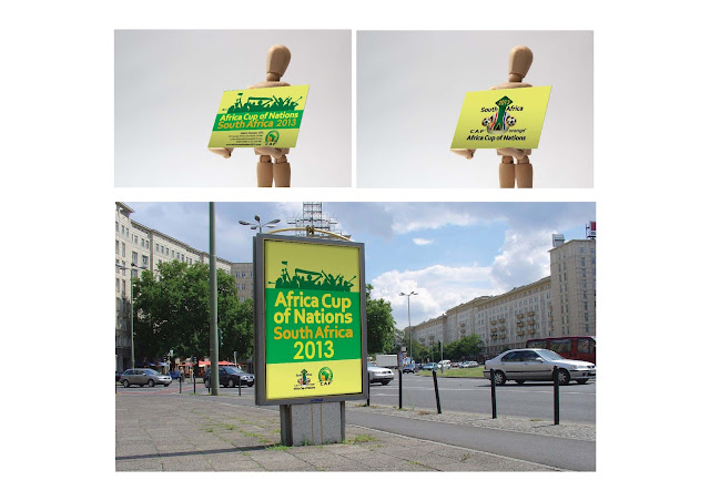
Africa Cup of Nation Corporate ID
As part of communication design II, we were given the task of designing a logo and promotional campaign for the Orange Africa Cup of Nations, which South Africa hosted this year. We had to give 2 logo options, choose 1 and do items such as a business card, banners, posters and kiosk branding.
Photography: Light
Another second year Graphic Design project for photography, this time we had to shoot specifically with lighting in mind. We had to submit photos with both artificial and natural lighting. Also to be considered was the different times of day to shoot, and how the lighting can change the colours.
Photography: Lomography
This was the first photography project we did in second year Graphic Design at DUT. The title is Lomography.
The rules of lomography are:
1. Take your camera everywhere you go
2. Use it any time – day and night
3. Lomography is not an interference in your life, but part of it
4. Try the shot from the hip
5. Approach the objects of your Lomographic desire as close as possible
6. Don't think (William Firebrace)
7. Be fast
8. You don't have to know beforehand what you captured on film
9. Afterwards either
10. Don't worry about any rules
My photos were all taken at the 2012 Midmar Mile.
Subscribe to:
Comments (Atom)


